


The Seven Sins of Workplace Visual Design
How to write and lay out information so people will actually read it

I love writing (go figure). And perhaps the hardest thing to accept about my writing, in particular in the workplace, is that no one is obligated to read it. As a student I was always guaranteed an audience of at least one, regardless of the quality of my essay/report/scholarship application. Or rather, regardless of how easy my work was to digest.
From high school to undergrad to my masters, almost my entire formal education related to writing focused on the substance of the ideas and how to verbalize them - developing a thesis, structuring my paragraphs, and choosing my words. Almost no one taught me how to make my words look good on a page (or slide, or poster, or image). These were skills I learned in my more niche courses, or near the end of grad school when I worked as a writing and communication coach. Opportunities that most people don’t get. And it shows.
Once I started learning basic formatting and graphic design, I started taking the principles for granted as essential and valuable, assuming they were second nature to everyone. Then I started working in an office. I quickly realized that skills I thought were foundational and somewhat universal were too often either unknown or pushed aside in favour of density. The result? Slides and papers of important information that I try everything I can do to get out of reading. But I’m often stuck with it, because my higher-ups have delegated the reading to me because they don’t want to read it. While you can often get away with scribbling some words on a page, and sometimes that’s all you have time for, it usually doesn’t take much to give those words a clear meaning and a fighting chance at being read.
So, in the spirit of better is possible, I’ve gathered the seven worst design and formatting issues that I regularly see in the workplace, along with some words on how to avoid them. Additionally, I’ve organized them into three sections: planning, drafting, and editing/proofreading. This is because some of these points are best taken into consideration as early as possible, while others don’t really come into play until you’re almost done.
The Seven Sins of Workplace Visual Design
Planning phase
Unclear message. The very first things you should ask yourself when you’re planning your writing are, “Why am I making this?”, “Who is this for?” and “What do I actually need to communicate?” Often, especially on topics we love or know about, we see everything as important and lose the core message. But almost always some things will be more important, or more relevant, to our audience than others. The answer to these questions will help you determine the format you should be using to convey your message. For example, perhaps a few paragraphs could work, but a flowchart might better convey the relationship between points. Or, maybe there isn’t really a strong core message and you simply need to store information, in which case you’re creating a reference document where items need to be easily findable and understood in isolation. If you really can’t afford (or bear) to part with information that’s not central to your message, consider putting it in an annex, appendix, endnotes, or bonus slides so it doesn’t dilute or distract from your main message.
Ignoring the medium. People generally know that different formats lend themselves to different situations. That’s why I often get asked to make short slide decks or ‘placemats’ (a single slide that provides an overview on a topic) rather than writing an essay. But knowing that a certain format tends to make for more digestible content doesn't mean you know why, which puts you at risk of undermining its key features and recreating more familiar conventions that don’t serve you. Committing this sin is how you find yourself in situations where you’re reading an ‘infographic’ that’s really an essay but each paragraph is in its own box and there’s some clipart beside the title. Know the conventions of your chosen medium and stick to them to fully leverage its strengths.
Ignorance of the viewing method. Most of the materials I find myself making are done on a laptop/desktop, to be read on a desktop/laptop, which makes my work pretty straightforward. However, occasionally slides are going to be projected in a room, documents are going to be printed, infographics are going to be uploaded to a website, and web pages are going to be read on mobile. This usually requires some adjustments! Slides that will be presented by a speaker should have way fewer words on them and more visuals, or even no words at all. Anything printed should have sizing considerations since you can’t zoom in, and needs to be able to fit a standard sheet of paper. This one is also a reminder for me; I recently whipped up a quick graphic where I took liberties with the dimensions and used dark accent colours to make it pop in a sea of white documents. This worked well when it was a PDF being circulated by email. But then someone tried to print it for an in-person meeting and we quickly realized it didn’t quite fit right on a sheet, and it drank up an ungodly amount of toner.
Drafting
Visual elements and text are in conflict. You generally wouldn’t put a smiley face in a condolence card, right? For most people it would be jarring and undermine your written message. Similarly, be sure that your chosen visuals support your message rather than creating confusion. I recently saw a slide with three headings, each of which was in a box. One of the headings was longer than the rest, and was in a larger box. It was also the first heading on the slide. This created the impression that it was the most important point, or perhaps that the points were ranked in importance. After confirming with the author that the points were of equal importance and presented in no specific order, I resized the boxes to be identical and shrank the font to make the headings fit comfortably, and rearranged them on the slide to make them more balanced. Other examples of this sin include inconsistent colour coding, bolding or putting stars beside things that aren’t actually important, or including a graph that makes a point that is literally the opposite of what you are trying to argue (yes, I’ve seen this).

In this example, one heading box is much bigger than the others, drawing the eye to it. It makes the slide look unbalanced, and could make a reader think that the first point is the most important. It is also not aligned with its corresponding text box, or the other heading boxes.
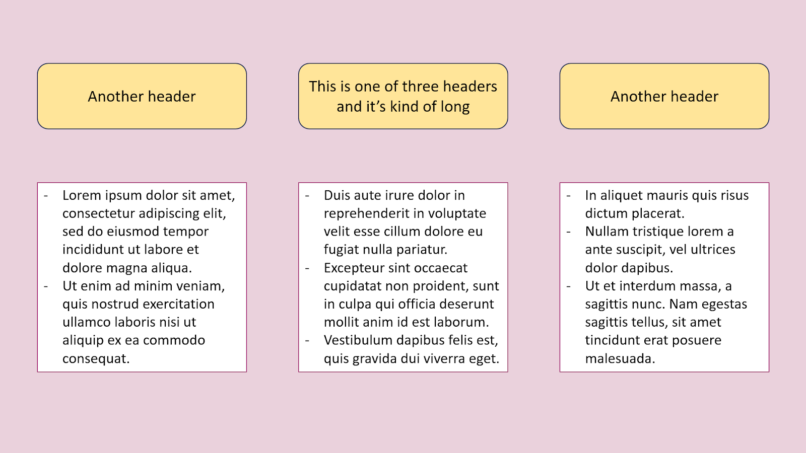
In this version, the headings have all been resized to have identical dimensions, to align with the text boxes, and have equal spaces between them. The font is smaller to allow for the full title of the longest heading to fit comfortably inside the box, and the other headings enjoy more negative space. This creates an overall balanced look between all three sections.
Over-emphasizing page counts. Just because you can fit all of that information onto one page, doesn't mean you should. I often hear requests for “one page of paragraphs/bullet points on x.” or “Can you bring this down from 3.5 pages to 3?” This often encourages writers to try to cram as much information as possible onto the page by using a small font size or eliminating spaces between paragraphs or tweaking their words to fit perfectly onto a line. I get it, it’s satisfying to do and makes you feel efficient. But what this ends up doing is crowding the page and eliminating white space, giving your reader no room to pause, breath, and process what they’re reading. And frankly, quashing their desire to read it in the first place for minimal gains in information. Remember, often your reader doesn’t have to read your writing. If it looks like too much work they’ll skim or pass altogether. Yes, adding headings and spaces between paragraphs will mean that you have fewer words on your page. But if it’s the difference between having your words read or ignored, you’re still finishing ahead.

This example has narrow margins, small font size, and spaces removed between the paragraphs and bullet points. It’s hard to visually parse where ideas begin and end.